OS X Yosemite Beta 1 (MacOSX 10.10) review - going mobile, revolution or step back?
Some days ago, Apple has released Yosemite Beta 1, the beta version
of the coming MacOSX 10.10 supposed to be released in the Fall 2014.
This
new version introduces some important changes and seems to fill a
gap between the mobile and the desktop version of Apple OS, which I had
envisioned some days earlier commenting on a LinkedIn post.

The most important change is the overall look of the OS, that seems to adopt several features from iOS.
I’ve
read enthusiastic comments online about this new look and how it makes
MacOSX more modern and cooler, but I don’t feel like sharing this
enthusiasm.
I don’t like the new flat Dock and I don’t think
all the features of the mobile version are suitable or can necessarily
work out for the desktop version as well.
I’m not big on the color palette of the new icons either (especially with regards to Finder).
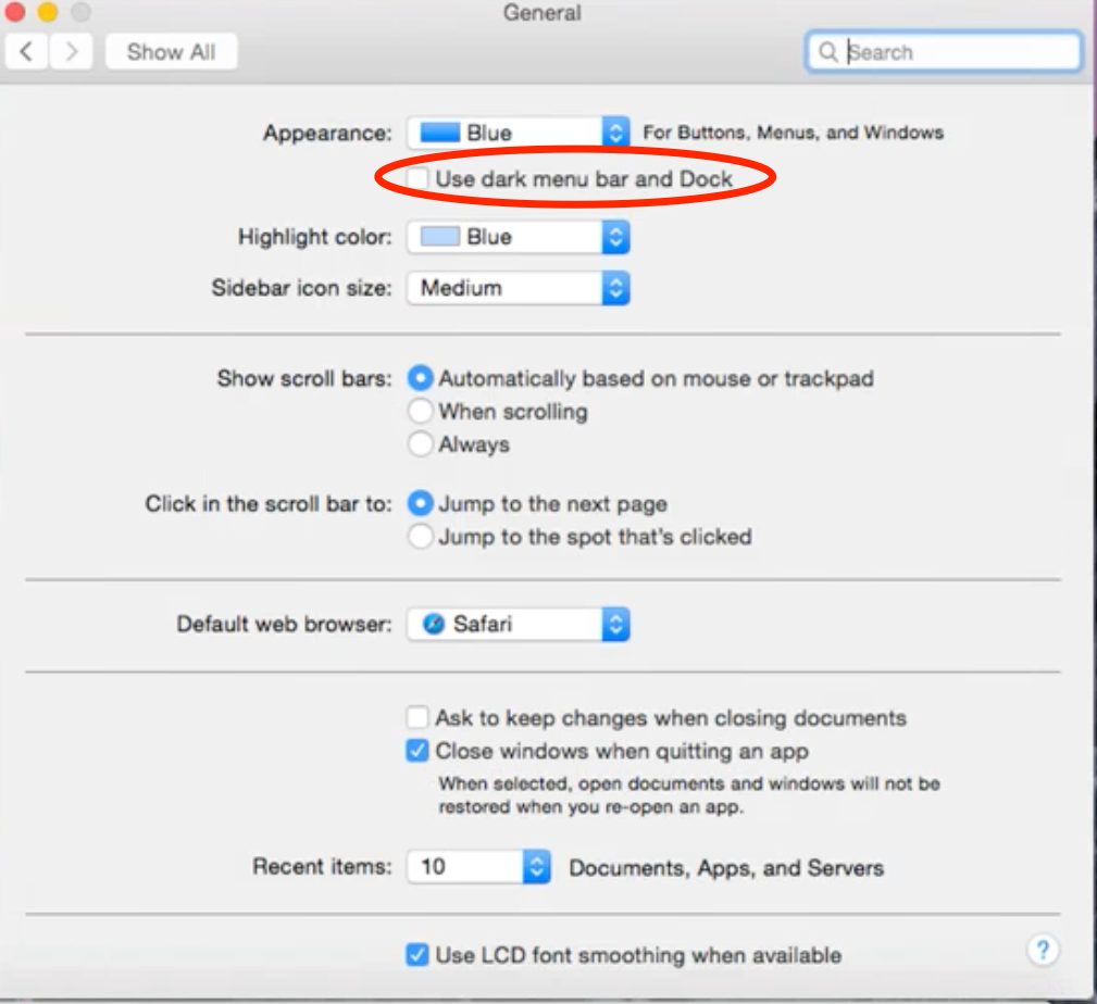
You can adopt a dark color for menu bar, dock and menu bar overlays, an option I definitely recommend (see figures below).
I like it much better than the standard configuration, but that’s my personal opinion.


New features
- Spotlight:
Now shows suggestions from the Internet, App Store, movie showtimes,
locations nearby and more. Below is the result of my research for Thor.


- Finder windows in full screen: When you click the Maximize button (the green one) the active Finder window gets displayed fullscreen, unlike the previous MacOSX versions. That’s something I definitely favor and can also be helpful to Windows switchers. If you’re not convinced about this feature, you can revert the way the button works back to the past by pressing Alt while you click it.
- New Safari: Its look has been restyled and it’s also definitely faster. Favorites displays now links to the major social media (LinkedIn, Twitter, Facebook) and other common websites (Apple, iCloud, Yelp, Yahoo, Google, etc.). One thing I’m not big on is the new URL bar layout (just in the middle of the screen), but I guess users can learn to live with that in the long run. Safari can now display a list of all the open tabs by clicking on the button before the “+” (see figure below); it also shows which tabs are open on your other devices, allowing to close them remotely.

- E-mail annotations: Yosemite makes it possible to add annotations to an image attached to a Mail message. This allows you to fill out a PDF form, add annotations, shapes, arrows or zoom on specific points of the attached image from inside Mail App, without having to access Preview for this. You only have to attach the image you want to edit and click the Markup button on the right corner angle (see figure below). Apple has also introduced a new feature called MailDrop, which allows to send attachments up to 5 GB in size by uploading them to iCloud. There’s a little detail, though: it's only free for 30 days, then you need to sign up for a premium account. Apple is trying to compete with Google Drive with this new feature (you can upload the attachment to a message to your Drive by clicking its icon in the Compose Message window) but, though MailDrop can come in handy, that doesn’t convince me to pay for one third of the storage space I can have free of charge with Google Drive (not to mention mega, which offers 50 GB free). I’m not much in favor of commercial solutions, especially when I can have the same or a higher level of service for free.


MacOSX Yosemite Beta 1 is a very interesting and promising product, but it’s a work in progress and there’s still much to get done.
I’ve read enthusiastic comments and reviews online about it (see here for example), which seem to be based more on the look of the new OS than on what’s under the hood.
I think that both average and professional/corporate users are much more concerned about performance and reliability and there’s still a long way to go for Yosemite under this point of view.
The very look of the new OS doesn’t convince me either. I’m not big on the new flat Dock and the color palette of the new icons (the new Finder icon is hideous, and I’m not the only one who thinks so).
Apple wanted to appeal its mobile users by offering them an iOS-styled interface on a desktop OS, but I’m not 100% sure that what works for a mobile environment does necessarily good on a desktop, too.
The alternative dark look offers a good solution and to me it works better than the default desktop, but to me it’s a definite step back confronted with the previous versions.
I couldn’t find any Flash Player version supporting the Beta at the moment. In the mean time I could solve this problem by installing a Firefox add-on (YouTube ALL HTML5), which works decently.
Performance and reliability are still unsatisfactory.
I experienced frequent freezes and crashes and, though this is partly due to the fact I ran Yosemite on a virtual machine, the whole OS is still pretty slow. The boot time must be definitely improved (even though it depends on hardware configuration as well).
A sure plus is the new Mail annotation feature, that can positively impact productivity.
In my opinion Apple risks to make the same mistake as Microsoft did when they launched Windows 8, which tried to appeal mobile customers and instead deeply dissatisfied desktop and corporate users, but there’s plenty of time to address these issues and ensure a satisfying user experience.
MacOSX remains more user-friendly than Windows, whatever Windows enthusiasts may say about it, but Apple still needs a lot of work for Yosemite to move on the right track.


Comments
Post a Comment