MacOsX Mavericks: free upgrade, no revolution (part 2)
Most important changes
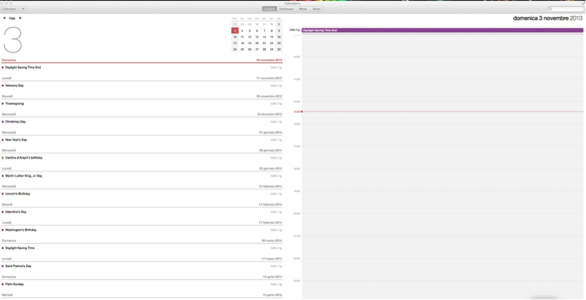
iCal now has a much more modern look (it no longer resembles a leather planner) and Gmail calendars can be handled more easily with this app than in the past.
 |
| The new iCal look |
Safari uses much less memory and is faster than before. It's the fastest browser on this new MacOsX version and, even though I've always liked Firefox better, the internet browser from Apple has an undeniable advantage: it uses much less RAM memory than its rival.
Apple added social integration to its browser. After enabling your Twitter and LinkedIn accounts from OS X’s system-settings pane, there will be a new Shared Links section showing in both the Safari Sidebar and alongside your Top Sites in any new tab.This section provides a list of everything your connections are linking to.
Apps ported from iOS7
iBooks gives iMac users the ability to handle their ebooks and novels with a single app taking advantage of a well-done graphic interface and a dedicated store. The integration with iCloud allows you to share notes and bookmarks to all your devices and the app remembers the page you were last reading, which is a good feature if you started reading something (e.g. a 700-page text book) on your iPad, for example, and then you want to resume on another device where you left off.
Maps has been added to the Dock with this new version.
The true reason of this choice seems fitting in the context of the long lawsuit against Google, which led Apple to exclude Google Maps from the iPhones for some time. In fact this app doesn't seem very useful on a desktop and doesn't add value for customers in terms of usability and reliability compared with Google Maps or Mapquest, though its interface is very enjoyable.
Reminders hasn't changed from Mountain Lion and its design remains basic and pretty much unchanged. In this case, too, we can say that Apple missed an opportunity.
Siri would have allowed any user to set up reminders way more easily, basing on time and location, simply dictating them to the vocal assistant.
Finder has received two main improvements:
- New navigation style supporting tabs, like the major internet browsers
- Color tags to prioritize your documents.
 |
The new Finder organization |
Now, Finder allows opening more folders at the same time in new tabs, like an internet browser, rather than in a new window.
To do that, you can hold the Command button (⌘) down while double-clicking on a folder or press the keyboard keys Command and T at the same time or choose New Tab from File menu. This is very helpful and allows you to keep everything at hand, thereby reducing the clutter on your screen. However, it doesn't always work.
If you open a folder from someplace other than the Finder, e.g. from the desktop, then a new window will open instead of a tab.
This bug makes the new feature a missed opportunity for Apple to make improvements.
Color tags:

This functionality was already present in the previous MacOsX versions (color labels for files) but it hasn't been very successful. So, Apple has revamped it as tags, along the lines tracked by Gmail or Evernote. I'm personally skeptical about how this can really be helpful to the average user.
In fact, unless you had already scheduled files into labels under older MacOsX versions (which are automatically organized in tabs under Mavericks), this organization has to be built from scratch, manually selecting and organizing the files, and this may require too much time to be worth it.
Another missed opportunity related to Finder, is Spotlight.
The Search function remains unsatisfactory and its date-based organization still leaves much to be desired, which means there's still room for third-party applications like FindAnyFile.
Stay tuned for the final part of Apple MacOsX Mavericks review.
Go to part 3 of the review
Go back to part 1


Comments
Post a Comment